Buttons
Buttons, Buttons and more Buttons!
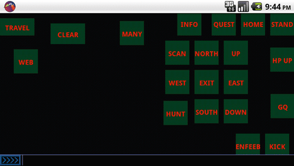
Touchable buttons that send commands to the server is the bread and butter of mudding from a mobile phone.
Currently BlowTorch supports any number of button organized into pages of buttons that are referred to as Button Sets. The buttons are used to send a predefined text commands to the server.
Contents:
Create New Button
Long clicking the screen in any place other than the input bar or another button will result in a new button being created at the pressed location. Any input text currently in the input bar will be used as the primary "click" command.
Button Actions
BlowTorch buttons offer 2 modes of operation. Normal and a gesture motion called "flip"
Normal
- A finger down and up ("Pressing") the button will result in the click command being sent to the server.
Flip
- A finger down, moved off of the button and released ("Flipped") will send the flip command to the server. Any direction will work, as long as the origin is the button, and the end is not the button.
Move/Edit Button
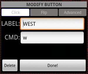
Long pressing the button will allow you to move it according to the current move mode set for the button, default is "Free". Holding the long press without moving the button will launch the properties dialog.
Button Properties
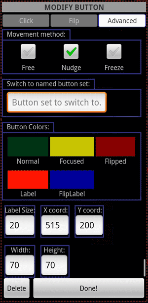
Aside from the labels and commands for the click and flip commands, the following properties are also available for editing.
Movement Method
- Free - The default movement method. The button will track the finger as it moves around the screen. This can be problematic because the single point of touch may jitter.
- Nudge - For fine tuning the placement of a button, this is essentially the "Free" method scaled down by 10. So finer grained control may be used.
- None - This will disable this button for moving, the move state will still happen before the property editor is launched on long press.
Switch to named button set
- Entering the name of a button set in this field will cause the button to load that named set into the window when clicked. Currently no click/flip command is sent to the server if this field contains data.
Colors
Colors may be chosen for the following states via the Color Picker
- Normal - Color of the button while it is idle.
- Focused - Color used when in the "click" state.
- Flipped - Color used when in the "flipped" state.
- Label - Color used for the label on top of the "Normal" and "Focused" color.
- FlipLabel - Color used for the label on top of the "Flipped" color.
Type in controls
- Label Size - The vertical size of the label text. Overrides value provided from the [[Button Set]] defaults. Unit is a Density Independent Pixel (dip).
- X coord - The X coordinate of the center of the button. Unit is in pixels.
- Y coord - The Y coordinate of the center of the button. Unit is in pixels.
- Width - The width of the button. Overrides value provided from the [[Button Set]] defaults. Unit is a Density Independent Pixel (dip)
- Height - The height of the button. Overrides value provided from the [[Button Set]] defaults. Unit is a Density Independent Pixel (dip)
- Explanation of a "Density Independent Pixel" as described by the Android SDK Documentation
Large Labels
If the label size exceeds the bounds of the button rectangle, the options will now be given to "fit" the button to the new label. The option to fit the label is given when the property editor is closed. If the option is denied, no changes will be made, and the large label will be drawn over the small button.