Button Sets: So many buttons, so little time.
BlowTorch supports an unlimited number of buttons organized into pages called Button Sets. Any connection will have a button set called "default" with no buttons by default. All new buttons created in currently selected set will be loaded with the default values provided by the button set.
Contents:
- Create New Button Set
- Switch To Button Set
- Remove Button Set
- Modify Button Set Defaults
- Button Set Behavior for Landscape and Portrait orientations
- Button Set Behavior in Portrait Mode regarding keyboard and full screen mode
Create New Button Set
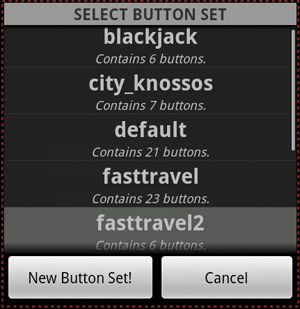
Creating a new button set may be done by pressing MENU->Button Sets. This will launch the button set selector, click "Add new" to create a new button set. This will be switched to automatically, and newly created buttons will be made in the new set.
Switch To Button Set
A set may be loaded by pressing MENU->Button Sets. The list of button sets will be loaded, and selecting one from the list will load the buttons into the window.
Remove Button Set
Long press an item in the list and it will give an option to modify the set defaults or delete the button set. The button set can be cleared if desired, or deleted entirely. The default set will be loaded if the deleted set is the currently loaded set. The default set can not be deleted (or renamed, which can't be done outside of editing xml).
Modify Button Set Defaults
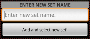
- To enter the button set defaults editor, long click (click and hold) one of the entries in the button set selection dialog. Select Modify from the options.
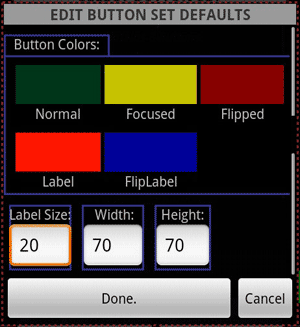
- The following attributes may be set for any given button set
- Changing these values will affect buttons that currently have the same value as the default. Buttons that have been modified will keep the values that have been modified, but values that match the set default will be updated.
- Colors may be chosen for the following states via the Color Picker by clicking the swatch.
- Normal - Color of the button while it is idle.
- Focused - Color used when in the "click" state.
- Flipped - Color used when in the "flipped" state.
- Label - Color used for the label on top of the "Normal" and "Focused" color.
- FlipLabel - Color used for the label on top of the "Flipped" color.
- Type in controls
- For precise control over the following options. All units are in Density Independent Pixels.
- Label Size - The vertical size of the label text.
- Width - The width of the button.
- Height - The height of the button.
- Explanation of a "Density Independent Pixel" as described by the Android SDK Documentation.
- For precise control over the following options. All units are in Density Independent Pixels.
Button Set Behavior for Landscape and Portrait orientations
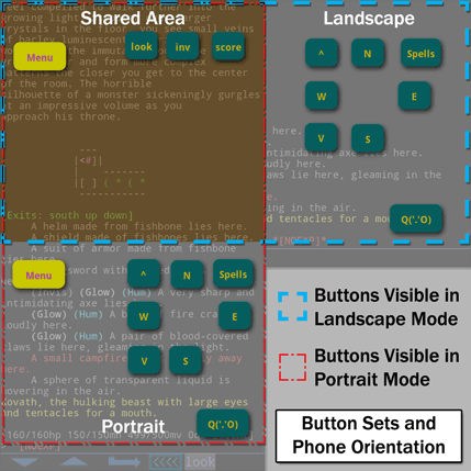
- Button sets always use the top left corner of the screen as the origin for the coordinate system.
- The "Button set area" can have buttons that are visible in portrait view and not in landscape, landscape and not in portrait and a shared area where buttons will be displayed on both screens.
- This behavior is demonstrated in the figure to the right.
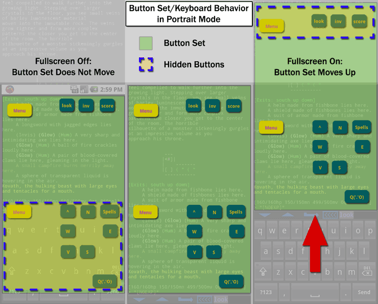
Button Set Behavior in Portrait Mode regarding keyboard and full screen mode
- When in non-full screen mode (the notification bar shown) the screen layout is updated to shorten the window when the keyboard pops up. As a result of this, when the keyboard pops up, the button set coordinate origin does not move. Buttons that appear in the keyboard area will be obscured by the keyboard.
- When in full screen mode (the notification bar hidden) the screen layout is not updated to shorten the window when the keyboard pops up. When this happens the coordinate origin is shifted up when the keyboard is shown. Buttons appearing at the top of the screen will be pushed off screen and buttons that are in the keyboard area are shifted up.
- This is demonstrated in the figure below.